This is the top directory for statistics for the Enhanced Precision Political Quiz in 2D.
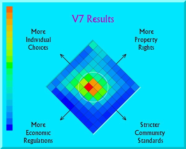
Version 7 is a complete rewrite of the Nolan Chart based political quiz. For this version I opted for an objective tone and a focus on specific proposals vs. sentiments. You cannot get small-government cred by claiming to want spending cuts in general. You have to call for cutting real programs which affect real people. Also, I have attempted to give as many bigger government options as smaller government options. And the intros list arguments from multiple sides; both pro and anti government arguments are given.
Version 7 is the latest version, deployed August 2012. Here is the breakdown of Version 7 political quiz stats
You can see how I score each answer by looking at the stats. See the right hand column. I use a 0-100 score, with 0 being the biggest government answer and 100 being the smallest. For most questions I set the status quo to be 50. I made exceptions for Guns and Health Care. For Guns, you get a higher than 50 score for keeping the status quo given the pressure to do something after the recent tragedy. For Health Care, you get less than 50 for the status quo, since ObamaCare is recent and not fully implemented. You get a 52 for calling for going back to what we had before ObamaCare.
My scoring is a bit weird for Social Security. The problem with Social Security is that payouts are in part a tax refund for taxes collected long ago. Means testing cuts government payouts, but it is also a retroactive tax on professional class retirees. Quibble if you like on how I score for this question, but note how I lean towards giving out scores below 50. Maybe I bias towards scoring people authoritarian for this issue.
At the bottom of the score column, you will see a total score. This is a weighted average score for all participants for the chart in question.
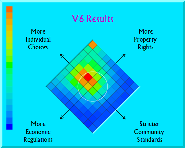
Version 6 of the Quiz ran from 2004 to the middle of 2012. Version 6 attempted to measure sentiment by giving levels of passion answers for each question. This made many people feel that the Quiz was biased. (The earlier versions were biased, blatantly so. The original idea was to attempt to offset the statist bias of the mainstream media to measure where people would stand if there was balanced coverage overall. People were offered the opportunity to react negatively to the biased intros, however. Producing false positives was not the goal.)
Anyway, here are the results from Version 6 of the political quiz—three hundred thousand data points sliced many different ways. And here is how Version 6 of the Quiz was scored. That is, here are the numerical values I assigned each answer in order to place people on the map.