Designing Signs
|
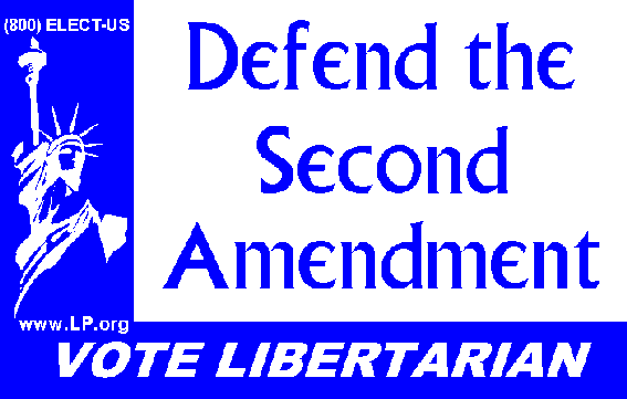
Consider the sign above from the 1999 experiment in Virginia. I used the following elements to provide a distinctive look:
- The pattern of light and dark space forms a stylized "L".
- The Statue of Liberty Logo is prominently displayed.
- "Vote Libertarian" is featured in all signs.
- The slogan is in a somewhat unusual font. (The one I used resembles that used in the old television show "The Prisoner".) The font should be one that is readable from a distance.
I used blue and white since an additional color added expense. With more colors, more possibilities...
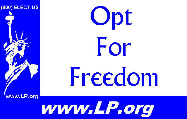
Note that the web site and phone number are not readable at a distance. They are included on the sign for when people walk by the sign, such as at polling places. To promote the phone number and/or web site from a distance, a special slogan sign could be used:
|
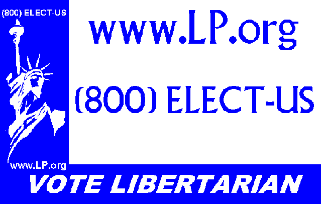
Or, the web site/phone number could replace "Vote Libertarian" on some of the signs.
|
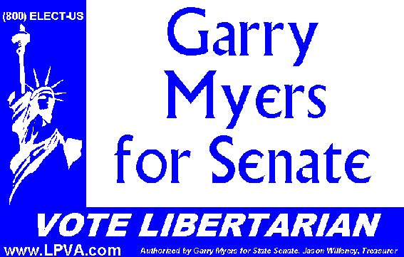
Here is a candidate name signs from the same experiment:
|
Note how the layout is not identical to that of the issue signs. A different
web site is used and in a larger font. Also the legalize was added.
Yet it is still obvious that the sign is connected with the issue sign
at the top of this page.